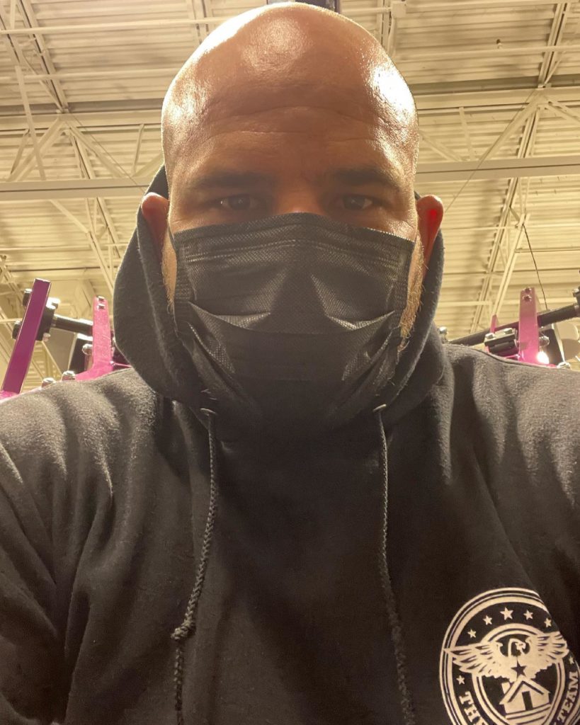
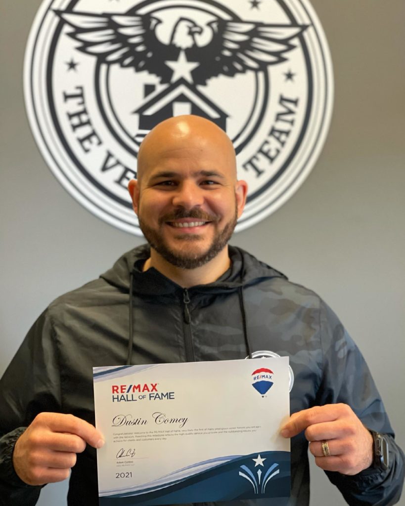
The Veteran Team is a real estate team specializing in housing for active and former military personnel and their families. Guided by Dustin Comey, a proud United States Marine Combat Veteran, this Washington state RE/MAX Town Center team has helped hundreds of families fulfill their real estate dreams in King and Snohomish counties for over ten years. However, looking at his dated logo, Comey felt that this symbol didn’t represent everything he wanted to convey to his special audience. He chose to invest in a new brand identity consistent with his message of service and support to veterans. Comey also wanted a symbol that was more dynamic and reflected the circular patches commonly associated with the various branches of military service.
The challenge was to create a unique symbol combining elements common to the military with housing while building trust through the visual. Comey’s focus on a round symbol complicated the design process because circular design requires special problem solving. Further, the logo needed to be obvious to veterans, while not excluding other potential home buyers.
The old logo attempted to incorporate many elements and failed to maintain relevant communication as time went by.
The Process
Comey contacted Think Tank Creative to explore a potential logo re-design. Jeremy Tank worked with Comey to define his target audience and build understanding through an audience avatar, identify brand attributes and create a brand strategy, research military symbols and design a new brand identity.
The new logo creates a timeless symbol that can grow as The Veteran Team expands to new offices and locations.
The Result
The Veteran Team’s new visual identity succeeds by incorporating everything Comey wanted in a unified and powerful circular symbol. Branches of service are represented by stars, and The Veteran Team is represented by a bald eagle sitting atop a house. Staged concentric circles represent the strategic stages of the real estate process, both buying and selling, and the eagle symbol crosses through all stages, overseeing every aspect of the process in the name of service. The typeface features block serifs, leading to greater feelings of stability, strength, and trust. Even at small sizes, the type is clean and has high readability. Finally, the white star in the center represents Comey’s heart and passion for helping his veteran brothers and sisters.