The owner of The Kraken’s Cup, Vallie Cross, had a very clear idea of what her logo should look and feel like. The challenge with having too clear an idea for your own branding is that some brand designers, graphic designers, or visual artists can’t connect with, understand, and capture the idea properly because the only place that idea exists in its entirety is in the holder’s imagination. Every artist will bring a background, visual style, and artistic idealogy that’s unique. Extremely talented people come to the design table with plenty of skill, but sometimes not the “right kind”. The clearer a client idea, the more difficult it can feel to capture the idea in a satisfying way that pleases that client. It further complicates the business relationship when designers create solutions which satisfy their own desires rather than meet the client’s specific request.
The Process
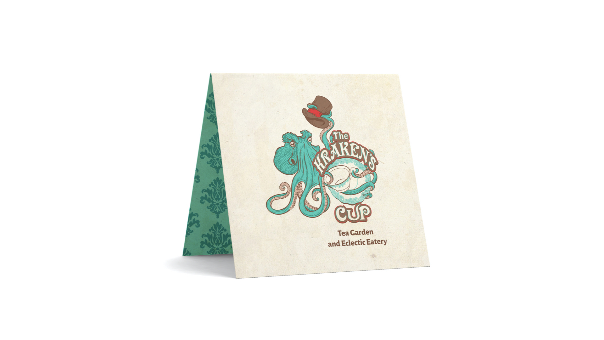
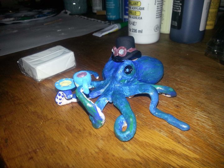
Cross contacted Think Tank Creative to finally move through the branding blocks she was experiencing. She shared that she’d already worked with do-it-yourself online software as well as an artist and designer, but none of them could deliver what she wanted. When Cross shared the vision and previous work it was easy to see why. The Kraken’s Cup was to be represented by an octopus holding a teacup, and somehow include a top hat. Cross had this vision for years and it was based on a scultpture she owned. Additionally, Cross had already selected colors she wanted to use, based on her color palette for the physical location. This painted a picture of a complicated visual symbol whose parameters were exceptionally well-defined.
Jeremy Tank worked with Cross and guided her through the branding process. Tank questioned foundational assumptions about The Kraken’s Cup audience and business, explored opportunities to re-align with an identity system rather than a single logo, and offered advice about the design and execution of the logo to help it appeal to the right audience as well as scale across all necessary media.
Think Tank Creative developed Mood Boards, Customer Personas, Empathy Boards, and Brandscapes (sample above) in the process to create the brand and design strategy for The Kraken's Cup.
The Result
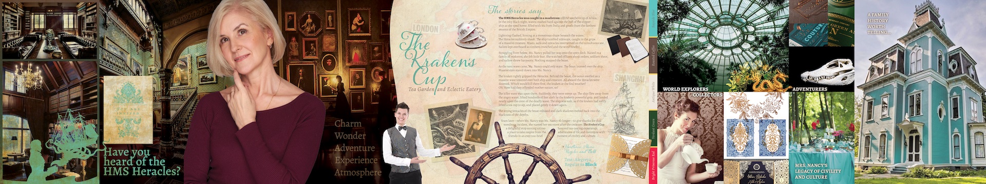
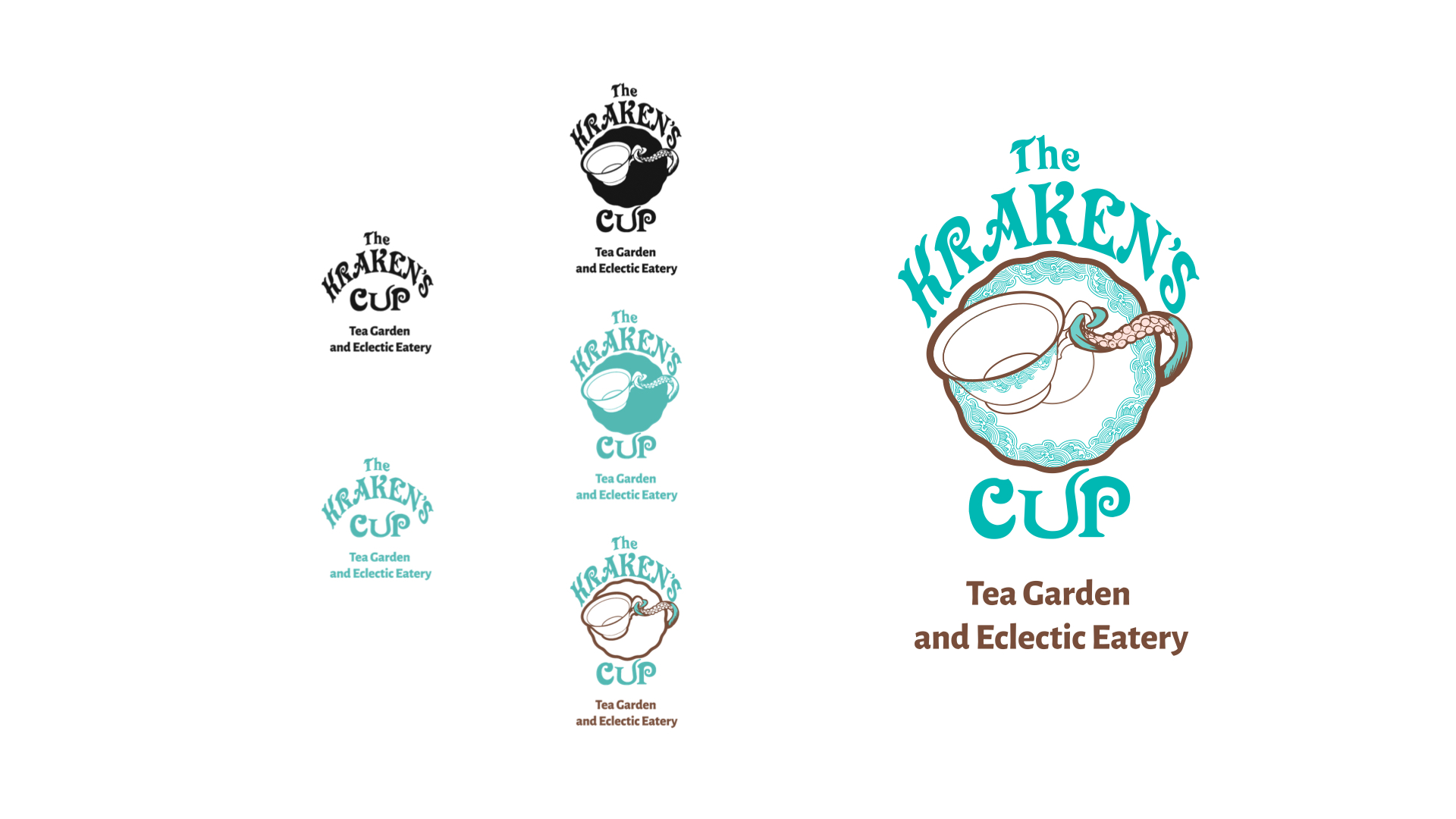
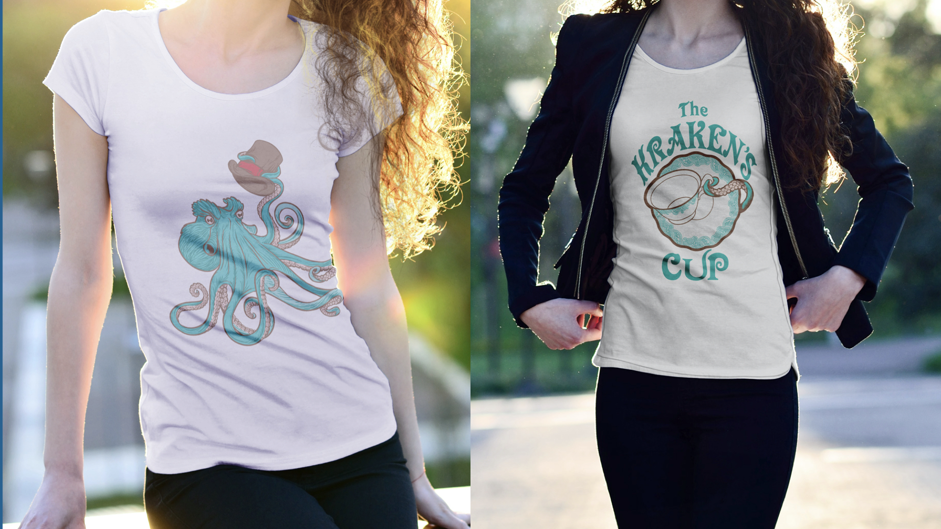
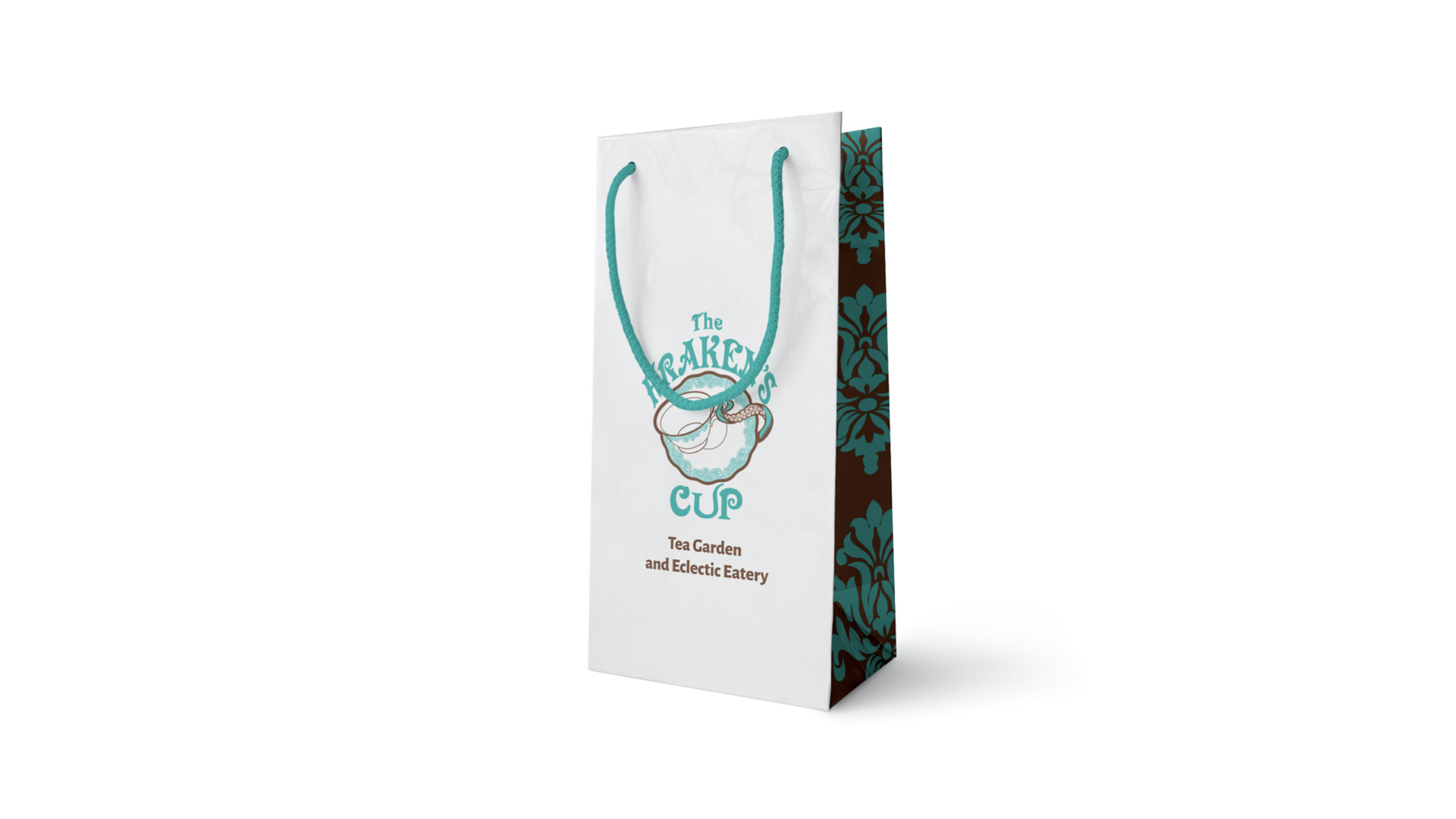
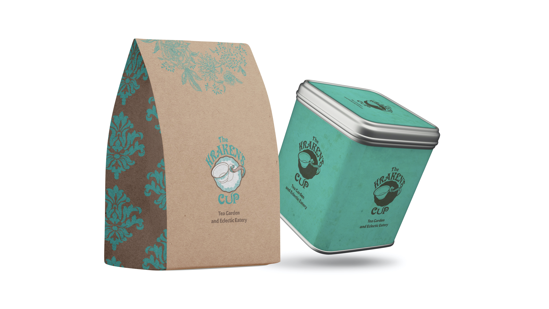
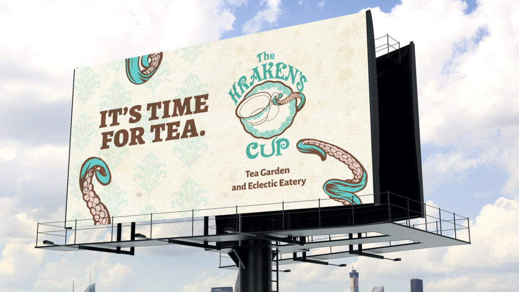
Renowned artist and designer Terri Francik was contracted to illustrate the kraken. The final identity works by scaling the kraken within the overall logo. While still a main feature of the identity, The Kraken’s Cup brand system allows easy readability at small sizes and offers rapid recognition without the kraken becoming too overwhelming. This means the name of the business is always a perfect size; increasing legibility and readability. In turn, this makes it easier for audiences to learn and remember the business, a major advantage when building a brand. The color palette uses traditional Pantone color values which closely relate to the desired paint hues while being fully, accurately represented across print and digital applications.
Today, The Kraken’s Cup shares experiences of tea and delicious tiny sandwiches with the world as Cross continues building her tea empire.
The Kraken's Cup identity system adjusts to fit appropriate spaces.